


The Tretyakov Gallery thanks Ivan Kardashidi for support of the exhibition
Anna Antonova, Lydia Tornstensen and Yevgenia Plotnikova also contributed to the publication.
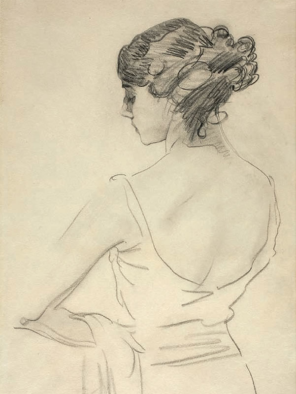
Pencil drawing is one of the oldest art forms, the source of all visual arts, recording the inception of an idea and the stages of its further development. But drawing also has a life of its own as an independent art form with a distinctive language, specific rules and history.
Pencils come in many different varieties - silver, lead, graphite, black chalk, wax, coloured pencils, lithographic pencils and other types - and the word also refers to a large number of similar media which can be categorized as the techniques of “dry drawing”, like charcoal, sanguine and sauce. There is an almost limitless variety of techniques involving the use of these materials, and they serve to show off a particular artist’s individuality, sense of form, innate talent and level of skills. A drawing in pencil, charcoal, sanguine or sauce is the best reflection of its creator’s temperament and character. From the vast variety of pencil and pencil-related techniques every epoch chooses those that suit it best. The age of classicism treasured the austere beauty of linear drawing, romanticism - the contrasts and the picturesque quality of strokes; for the “Peredvizhniki” (Wanderers) artists, pencils were “modest workers”, and the modernist movement re-invented the selfsufficiency of lines and the aesthetic value of the process of drawing as such.
The exhibition devoted to Russian drawings pays attention to the characteristic marks of different time periods, and “traces the contours” of different eras. The Tretyakov Gallery holds a unique collection of drawings by Russian artists, one which quite fully and comprehensively reflects the development of this form of visual art in Russia. The exhibition features about 250 pieces by acclaimed masters of drawing, such as Alexander Orlovsky, Orest Kiprensky, Alexei Venetsianov, Karl Briullov, Alexander Ivanov, Pavel Fedotov, Alexei Savrasov, Ivan Shishkin, Ilya Repin, Valentin Serov, Mikhail Vrubel, Konstantin Somov, Philipp Malyavin, Boris Kustodiev, Boris Grigoriev, and Kazimir Malevich.
In 18th-century Russia pencilled drawings were mostly produced in the course of preparatory work. The pencil as the medium for rough drafts was used by architects, decorators, sculptors and painters. Drawings were never regarded as having any artistic value in themselves, and collectors almost never took an interest in them; as a result very few drawings of the age have survived, and each extant piece is now a rarity. 18th-century drawings are especially interesting as records of the development of drawing techniques and media. Media such as silver and lead pencils — used on their own or in combination with black chalk — are virtually unfamiliar to the contemporary viewer. Such curios held at the Tretyakov Gallery include copies, by an unknown artist, of Johann Baptist von Lampi the Elder’s painted portraits, made on coloured primed paper with silver pencil and black chalk (Italian pencil) with the addition of chalk. A small drawing “Portrait of Catherine II”, accomplished by Yevgraf Chemesov in 1762 (a copy of Vigilius Erichsen’s portrait, executed as a part of engraving process), is an example of a drawing made with silver pencil alone, showing off the pencil’s fine “scratching” strokes. The lead-pencil drawings featured at the show were accomplished at approximately the same period. Lead pencils were often used by Anton Losenko: in his two studies for the painting “Hector Taking Leave of Andromache” (1773, Tretyakov Gallery) the properties of the pencil define the character of the drawing. One piece is executed with a lead pencil, which leaves on paper fine shining depressed lines. In another piece, a soft black chalk smoothly traces the outlines of the figure.
The featured works of non-Russian masters, like the Polish artist Daniel Chodowiecki, are also of interest. One of the earliest examples of the use of graphite pencil in drawing is Jean-Frangois Thomas de Thomon’s excellent piece “Landscape with Antique Ruins”, where the media of graphite and lead are harmoniously combined. It is well known that Thomon executed the piece in 1794 and then took it with him when he came to Russia in 1799. In Russia graphite was to gain circulation as a drawing technique only much later.
In the landscapes of early-19th century pencil drawing, while still an auxiliary factor in the creative process, was gradually coming into its own as an art form with its own original rules and means of expression. One can feel this especially well comparing two unique landscapes — one, Stepan Galaktionov’s “Tree”, is an imposing, large work featuring spectacular contrasts of dark and light, that was designed to look like a painting. The other, Fyodor Matveev’s “View in Italy”, is an example of a purely graphic treatment. The flowing lines on a white sheet of paper and the neat composition of the space produce an austere and harmonious image of nature. Matveev in his graphic work adhered to the classicist canon of landscape painting more rigorously than other artists of the period in their paintings. Matveev’s several sketches from nature displayed in glass cases are among the few surviving graphic pieces which demonstrate the significance of drawing from nature in the course of work on compositions or paintings. The landscapes by Sylvester Shchedrin, Mikhail Lebedev and the founder of the Moscow school of landscape Karl Rabus are distinguished by their diversity of styles and imagery.
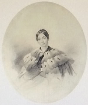
But it was only in the first half of the 19th century that pencil drawing began to be regarded as equal to other art forms. In the romantic era, with its focus on people’s inner worlds and aspirations, and changes in their mood, pencil became an ideal means of communication. Black chalk, called in Russia “Italian pencil” because it was brought from Italy, replaced silver and lead pencils. The properties of black chalk, such as its softness, velvety touch, capability to vary the thickness of lines and to create almost painterly effects of light were used with especially good results in portraits. Orest Kiprensky was one of the best masters of graphic portraiture, whose works combine an astonishing harmony of captivatingly charming poetic images with a display of the beauty of the technique itself. Each of Kiprensky’s portraits is an improvisation with mercurial, lively strokes, diverse and individualised in every single piece, with fluent lines, and with fine, almost gossamer modelling of faces. In his “Portrait of an Unknown Boy”, made in 1812, the artist used colour such as sanguine and pastel highlights, while in other portraits he used only purely graphic techniques.
Kiprensky’s drawings were greatly appreciated by his contemporaries — his circle of admirers included Alexander Pushkin and Vasily Zhukovsky — while collectors sought them out. Perhaps this gave rise to the widespread belief that he was the founder of the genre of the pencilled portrait, while in fact this is not quite true — at that period many other artists were drawing portraits. The show highlights characteristic features of these artists’ styles, each of which has an original individuality. Vasily Tropinin is marked by a greater softness, a penchant for stumping, and a predilection for coloured paper, which helps to convey subtle nuances of lighting. Alexander Orlovsky’s style is distinguished by expressive forms and frequent utilisation of black colour in combination with sanguine, which sets off the black chalk. The work of Alexander Molinari, the European artist who worked in Russia for a decade from 1806 to 1816 and enjoyed great popularity, is marked by the sentimentality of its imagery. Molinari used wet brush and wash drawing, which lent a soft touch and delicacy to his images.
Karl Hampeln’s style was characterised by crisp contours of human figures and cross-hatching, which combined the technique of two pencils “lusciously”, producing drawings that looked like engravings. Painters specializing in historical themes, too, created remarkable portraits — Fyodor Bruni’s 1835 piece “Portrait of the Princesses Praskovia, Nadezhda and Maria Vyazemsky” is one such example.
The first half of the 19th century was a period when the pencilled drawing was “king”. The craft of drawing was taught not only at the Academy of Fine Arts, but also at military schools and at home, and everyone drew — artists, writers, poets, and educated amateurs. Such noteworthy images include the “Portrait of Pavel Fedotov” (1828) by Fedotov’s colleague A. Stromilov. The show introduces a wide array of “varieties” of graphic portraits: poetic and lyrical images of women; portraits of “prominent people of the day” — heroes of the war against Napoleon, poets, and artists; self-portraits; children’s portraits; and caricatures.
Alexei Venetsianov produced portraits as well, but his genre scenes on coloured paper showing his quest for “type”, peculiar characters, and funny situations are equally noteworthy. Venetsianov’s pieces record the birth of a new trend of depicting everyday life which was to reach its highpoint in the second half of the 19th century.
The genre of the pencilled portrait came to fruition in the 1820s-1830s, with works by Karl Briullov created at the end of that period: his portraits of Lyubov Makovskaya and Ivan Vitali (both in graphite, 1836) and the remarkable black- chalk image “Head of a Woman” (18431847). In the latter piece, one cannot easily understand whether this is a portrait or a study for a future painting. The diversity of the media and of style and manner of plying the pencil in Briullov’s sketch provides insights into the workings of the artist’s mind. In Briullov’s own words, “...the pencil should follow the course of thought: when thought makes a turn, the pencil should do so as well”.1
Learning to draw with black chalk, sanguine, sauce, and later graphite pencils and charcoal, was a cornerstone of the curriculum at the Imperial Academy of Fine Arts. The methods of artistic education remained basically unchanged for many decades until the early 20th century.
Students were taught different techniques while gaining an appreciation of the distinctive features and the beauty of each: the Academy had a well-rounded curriculum. The show highlights its most important characteristics, and many drawings on display demonstrate the artists’ superb skills. Transcending the limits of student work, many of the pieces emerge as artwork of the highest quality. The best ones garnered medals for their creators and were kept as models to look up to.
Children were admitted to the Academy at an early age, six or seven, and training included five stages — “five ages” (three years in every “age”). At the fourth or fifth stage, students started drawing live models in live drawing classes, and only professors of historical painting could prescribe specific compositional arrangements with the sitters. The exhibition features some such works, including Anton Losenko’s “A Male Model”, accomplished as early as the mid-1760s at Joseph-Marie Vien’s workshop at the Academy of Arts in Paris; Karl Briullov’s marvellous drawing from 1817 where the artist employed three kinds of pencil — black chalk, chalk and sanguine; and Ivan Kramskoi’s “Male Models” (1861), where the artist emphasised the corporality of the images, in line with the nascent aesthetic norms of the second half of the 19th century. Drawing gypsum copies of classical statues was an important component of the academic curriculum — one example of these student exercises is a piece called “Apollino” (1790), by an unknown artist.
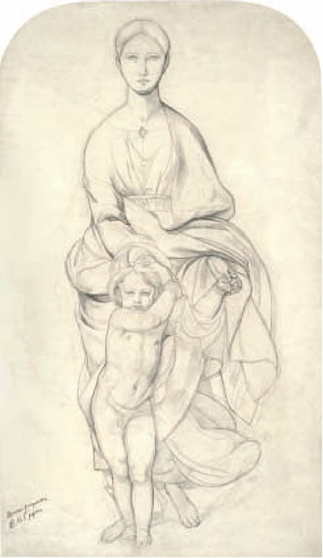
Graduating from the Academy, artists had to accomplish several sketches on assigned themes. The exhibition introduces quite a few such compositions by better- and less-known masters. The pieces demonstrate a consistency in academic training, while at the same time every drawing shows off the individuality of its creator. Vasily Shebuev’s “The Adoration of the Magi” (late 1820s-early 1830s) features emphatic lines, crisp silhouettes; Alexander Ivanov’s compositions are distinguished by their baroque dynamics and agitated forms; Orest Kiprensky’s study “Death of Cleopatra” (1803) features melting contours and areas of gently smudged tone that lend a romantic touch to the image. Other works on show include a large piece “Coriolanus at the Wall of Rome” (from the late 1830s) by a little known artist Pyotr Shamshin, which is displayed for the first time after extensive restoration. Ilya Repin’s “Diogenes”, of later origin (1867), looks perfectly in place among the student work from the first half of the 19th century and highlights the consistency of the training programmes. Another figure, Alexei Egorov, was one of the most interesting graphic artists of that period, whose talent was revealed with special clarity in his drawings.
Fellowships for international travel awarded to the best students were a singularly important element of the education process. Among them was Alexander Ivanov, who continued to hone his skills at the Academy in Rome. The collection of his drawings held at the Tretyakov Gallery contains gems he created during his fellowship, and his superb female images are especially noteworthy. The Russian Academy did not employ female models and, once in Rome, Ivanov did his best to “make up” for this gap in his education, and turned a student exercise into a remarkable piece of art. Ivanov did not “prettify” the forms of his female sitters from the 1830s-early 1840s, but found beauty in each woman’s individuality; the pencilled lines emphasise the expressiveness of the silhouettes, the lightness of the agile contours of the figures, while fine hatching conveys the smoothness of the forms, showing off the complete range of tonal gradations achievable by working in pencil. Another important component of the academic education was the students’ introduction to the artwork of the old masters; copying was a part of the training process, and the fellowship holders presented copies they had made when they accounted for their travels. Those made by Ivanov (such as “Adam. A Fragment of a Fresco in the Sistine Chapel”, 1831) are more than just copies — they are the result of a complex creative process in which the artist “assumes” the way of thinking of another era and strives to understand another master’s work “from inside”. Ivanov’s drawing of the “Medici Venus” statue (1830) is a true masterpiece: “I saw the Venus again, I forgot about the imitations we had. I do not know anything so perfect as this,”2 Ivanov wrote. In his piece he contrasted sculpture and graphic representation — weight and lightness; three images of the statue from different angles convey all the richness of its forms, and the gentle sfumato of the hatching seems to capture the glow of the marble.
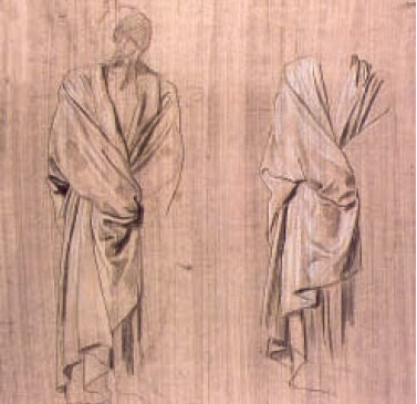
The Russian Academy of Fine Arts had a so-called “mannequin classroom”, where artists learned the skills of drawing figures “dressed” in the fashion of ancient Greeks or Romans. There were several modes of arranging a piece of cloth on the
mannequin — “tubes”, “screw”, and “flowing folds”. When Ivanov came to Italy, he saw this diversity of draping modes in the Italian masters’ paintings, where drapery was an important element of composition: his acquaintance with these paintings led him to create a whole series of “drapery” pieces in the 1830s- 1840s. In his drawings pencilled on coloured or tinted paper, many touched up with white paint or chalk, a simple fabric becomes filled with the juice of life, and seems to be moving slightly.
The whole training process was designed to prepare students for the creation of a painting. Ivanov’s sketches on view trace the evolution of the idea for his future acclaimed composition “The Appearance of the Messiah”: from conception to the well-rounded composition rich in detail, as it germinated into a painting reflecting a wealth of human emotions, feelings and characters. His later piece “The Expulsion from Paradise” (1846-1848) is of singular interest. Delicate pencilled strokes form a silvery net over the surface of the paper; barely touching the paper, the pencil traces the flowing lines of the folds, lending an ethe-real touch to the image. The composition “God the Punisher” (1846-1848), where the visuals are created with tonal spots and vibrant hatching rather than with lines, echoes Mikhail Vrubel’s images of Seraphs.
In the second half of the 19th century graphite pencil became the most common drawing tool. The “pencil the modest worker” resonated with the aesthetic and moral ideals of the age of critical realism more than any other medium. At that period drawings were mostly created in the course of preparations for a major piece. Drafts and sketches from nature, outlines of compositions of future paintings, drawings accomplished during travel, at meetings, at home were made with graphite or, less frequently, with graphite in combination with black pencil. The manner of drawing itself stresses the sketchiness and the auxiliary character of the pieces. Works on display at the exhibition include studies for acclaimed paintings by Vasily Surikov, Ilya Repin, Vladimir Makovsky, Vasily Pukirev, and Vasily Perov. In this group of graphic pieces, even portraits feature sitters that are neither posing nor “showing them selves off”: models are often depicted at work, in the course of their everyday activities. Such a trend is represented by portraits and self-portraits (Vasily Astrakhov’s “Portrait of Yakov Bashilov”, 1860; Fyodor Vasiliev’s “Portrait of Ilya Repin”, 1870; Yefim Volkov’s “An Artist Outdoors in a Forest”, 1881).
In an age when painting prevailed over drawing, artists practically stopped using media such as charcoal, black chalk or sanguine. But even when an artist used any of them — Pukirev in his “Portrait of Apollon Mokritsky”, from the 1860s, and Apollinary Goravsky in his “Portait of the Artist Maxim Vorobyev”, from 1854 — he would make an effort to “dissimulate” their specific properties, making the work of the pencil impersonal, nearly mechanistic. Perhaps the manner of drawing itself was influenced by the techniques of reproduction that were gaining wide circulation at the age, and by the technique of retouched photography.
In genre scenes, which were then very popular, graphite pencils were used in a very special fashion. Bearing this in mind, it seems worthwhile to compare the 1840s drawings by Pavel Fedotov and Vasily Perov, a representative of the new generation of artists. Echoes of the romantic period are still felt in Fedotov’s oeuvre — in the elegance and poetic touch of its images, the delicate balance between humour and criticism, and in the beauty of the pencilwork. A thin smooth line traces the silhouettes and lovingly and carefully sketches out details, conveying the models’ mood and state of mind. And only in a later piece such as “Husband the Thief” (1851) the artist played up the theme of everyday routines and strengthened narrative element. In contrast, Perov’s graphic pieces, such as studies for paintings and sketches for illustrations, feature deliberately “sloppy” pencil work that traces the contours more than once, piercing the paper in some places and neglecting to clean up the mess it leaves behind. The artist drew “for himself” and did not regard his drawings as an artwork in its own right.
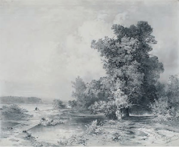
Nevertheless there was a genre of drawing where the properties of pencil and its diverse related techniques were used to the full — landscape, which went through cardinal changes in the second half of the 19th century when it began to be used as a vehicle for conveying emotions. Alexei Savrasov, Nikolai Sverchkov and Konstantin Kryzhitsky introduced into the white-and-black graphic style of their landscapes an innovative visual language and started to use new media. In the mid-1850s a new sort of paper called papi- er-pelle went on sale in Russia, and came to be used mostly in landscape painting. Thinly coated with gypsum of varying tones, the factory-made paper allowed a highly diverse visual effect, and could be plied with different drawing tools, such as pencil, charcoal, brush, treated with a touch of white, or with its priming scratched down to the base white shining layer of gypsum. It was the most complex and technically difficult kind of drawing, because images drawn on papier-pelle cannot be corrected — the drawer’s hand had to operate with faultless precision.
Savrasov was a brilliant master of papier-pelle drawing. For Savrasov, drawing always occupied a special place, and he drew all his life: “Drawing is the cornerstone of painting,”3 he taught his students. The exhibition features Savrasov’s pieces from different periods. Looking like accomplished, well-rounded paintings, his graphic pieces on papier-pelle created in the mid-1850s are imbued with lyricism and feature well-known views of areas near Moscow (“A View in Kuntsevo Village Near Moscow”, 1855; “Old Pines”, 1854). These pieces show off the artist’s creative freedom and technical skills, as natural forms are modelled with fine hatching of varying thickness. Contrasts of light and dark are created with smudged areas of different tones. The light-grey surface of papier-pelle and the silvery glow of graphite set the emotional mood of the landscapes. One of Savrasov’s finest landscapes of his late period — “Landscape. Volynskoe Village” (1887) — is made on papier-pelle with the use of diverse, rich drawing techniques.
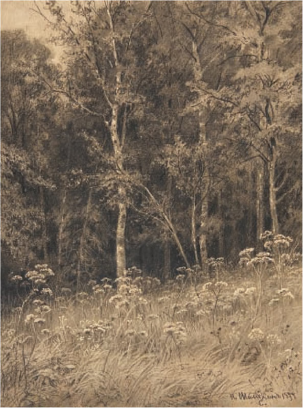
Also noteworthy are works by Shishkin, Kryzhitsky and Sverchkov, who preferred “mild” media such as black chalk, charcoal and sauce. Of the three, Ivan Shishkin is undoubtedly the most noteworthy artist. His drawings on display at the exhibition — “Flowers in a Forest” and “Ferns in a Forest” (both from 1877) — are true masterpieces distinguished by the undogmatic and picturesque treatment of their images of nature. The drawings were made on primed tinted brownish paper with the use of stump and brush, and dry and wet sauce. Shishkin also used the method of scraping: he scraped the upper layer of the priming to create areas of light tone to represent the heads of flowers and specks of sunlight livening up the semi-darkness of the forest.
The artistic dialogue between Ilya Repin and Valentin Serov in painting and, most importantly, in drawing defined a whole era in Russian art. “In Russian art in the 19th century, there were only two graphic artists as frantic, as passionate: Repin and Serov”,4 wrote Igor Grabar. The exhibition features only a small part of both artists’ graphic legacy, including their numerous sketchbooks. According to his contemporaries, Repin never parted with his sketchbook.
Repin passed on his love for drawing to Serov, whose apprenticeship in art began in Repin’s home. Repin’s and Serov’s pencil drawings of the late 1870s - early 1880s featured at the show demonstrate an utmost closeness of both masters’ pencil techniques and concepts of drawing. At that period Serov worked literally side by side with Repin learning the secrets of his craft. Repin’s portraits of Yakub (1881) and Vera Repina (1882) and Serov’s portrait of Tatyana Mamontova- Rachinskaya (1879) and self-portrait (1885) share such features as the treatment of the space, the modelling of faces — “the careful moulding of every little individual form” — along with symbolic treatment of the models’ images. Later each artist went his own way. They became exponents of different, sometimes contrasted, styles which nevertheless were both important for the development of pencil drawing. The range of Repin’s drawing techniques is as broad as can be: he employed with equal mastery and elegance strokes, spots, lines, combined them in different ways and enriched the art of drawing with a painterly sense of form while keeping within the boundaries of graphic art. The “Portrait of Alexandra Botkina” (1901) is a fine example of applying drawing techniques within the format of painting.
In Repin’s graphic pieces, drawing is a process without closure — sketchiness and the effect of incompleteness are the main characteristic and the chief virtue of his drawings. A form is being born from the maelstrom of strokes under the viewers’ eyes and as if with their “participation”... The white surface of a sheet, for the viewer, is not a plane but a space vigorously drawn into the creation of form. Repin employs a “rich but also irregular line” which not so much delineates the contours of shapes as “moulds” them — especially in shaded and hatched areas — the same way as a touch of brush in his paintings does. <...> Forms and volume are lodged somewhere between the lines — they are brought into relief by lines and strokes but do not reside in them”.5 In Serov’s drawings, to the contrary, forms are seemingly “peripheral” — the imagery is pivoted on contours. Serov relentlessly sought the ideal line revealing not so much the human as the artistic essence of the sitter. The pattern of the line and the manner it is being applied seem to originate from the sitters’ characteristics. In the study for the “Portrait of Henrietta Girshman” (1904-1905) transparent lines envelope as a cloud the figure of the standing woman and gently trace the oval of her face. In the sketches on carton for the “Portrait of Polina Shcherbatova” (1911) the masterful energetic strokes of coal convey the statuesque bearing of the model.
Serov’s visual language becoming ever more symbolically condensed, the painter was losing interest in the particulars of forms and trying to elaborate a more generalized and terse artistic formula. “I want to ensure my drawings have as little pencilwork as possible”,6 he wrote. Even when he became a famed and recognized artist, Serov tirelessly worked on improving his drawing technique. It is known that having made a sketch from nature, the artist would often place on it a sheet of semi-transparent paper, traced the most essential lines and continued his work on the new sheet. Then he would repeat the manoeuvre, thus giving the drawing the look of an allegory. The female figure in the “Abduction of Europa” is the result of such a long process of “working on the form”. Not surprisingly, Serov’s portraits of ballet dancers make up the most precious part of his graphic legacy. The illustrious dancers such as Anna Pavlova, Tamara Karsavina, and Ida Rubinstein were ideal models for Serov. The dancer’s expressive figure trimmed by choreographic exercise, the characteristics of her poses and movements, conceived to look like flat silhouettes from the auditorium, put in agreement the goals of choreography with the goals of drawing. The means of graphic art here enhance the achievements of choreography.
Drawings featuring sketches of interior decoration form a distinct group. Many, and maybe a majority of, large-scale design projects conceived in the early 20th century remained realized only on paper. The exhibition presents Serov’s large cartons with sketches for interior decoration of a Mrs. Nosova’s house and sketches in sanguine accomplished by Zinadia Serebryakova, Mikhail Dobuzhinsky, Alexander Yakovlev and featuring details of the design of the Kazan station, Moscow — the last monumental project of the Silver Age.
The creative method of Mikhail Vrubel as a graphic artist had a solid foundation in realism, formed by the Russian artistic tradition and developed due to his natural talents. Vrubel’s portraits on view highlight the special boundary between the real and imaginary worlds which is at the heart of the artist’s thinking and creative method. The animating energy of his art sublimates the images of real people into symbolic visions. The image of Mrs. Zabela-Vrubel as a Seraph, which seems to be willed into life by the artist, materializes from a host of quaking strokes; the pale, melting contours of his self-portrait represent not so much the artist himself as his shadow. On the contrary, the viewer can be easily misled by the portrait likeness of The “Head of the Demon” (1889-1890) and can easily believe that the artist did not conjure up this fleshless angelic face but really “saw” it, as he claimed. The corporality and sculptural fleshiness of the imagery is created, first and foremost, by the visual language itself, which uses images stored in our memory. This includes both the types of human figures and specific drawing techniques utilized by the Renaissance masters — the rippled gauze in the fashion of Leonardo’s sfumato is combined with the sketchy lines “in the fashion of sinopias”, characteristic of Michelangelo. Unusually large, the sheet of paper was primed so that its surface became like a plastered wall, giving the drawing the look of a fresco. The visual language, the take on form as expressed in this study of the demon’s head, intended for the future painting “Sitting Demon” (1890, in the Tretyakov Gallery), are inextricably linked to Vrubel’s work on his murals: the drawing was made on the reverse of a large charcoal sketch of the composition “Resurrection” for the St. Volodymyr Cathedral in Kiev.
Other drawings accomplished by Vrubel in Moscow include such masterpieces as a pencilled sketch called “A Horseman Charging Ahead” (18901891), conceived as an illustration to Mikhail Lermontov’s “Demon”, and “Portrait of Alexandra Mamontova” (1890-1891). In these works, the artist traced with a pencil only areas in the shadows, leaving the glowing sheet of paper to represent the dazzling light. These drawings seem to foreshadow the style of Vrubel’s late pieces, in which, in the words of Alexander Benois, “he wanted to convey the shining of objects rather than their light and colour”.
In his later period (1902-1906), drawing human figures became for Vrubel the main way of learning about the world around him, the sole connection between himself and the reality. Almost unable to work with paint, he focused solely on pencils and charcoal, taking the expressive potential of the technique to previously undreamt-of heights. In his pictures featuring the landscapes behind the hospital’s window, the bare branches of the trees are filled with a vital force, defying winter and the chill that seems to be creeping from the hardened banks of snow. In his portraits of its patients, the intricate disturbing rhythms of the hatching, which seem to convey the models’ mood, are captivating. The ash-tray shaped as the shell of a mother-of-pearl, a gift to the artist, is depicted as the “pearl of creation”, as a complex natural and artistic form. It is similar to a galaxy of stars; the combinations of hatches of different forms and thickness create the illusion of opalescent mother-of-pearl, while the grounds overlap, move, swirl around, and draw the viewer into the depth of the image. The creator of a whole suite of drawings featuring the shell, Vrubel claimed that “paints were not at all needed for conveying the colour of an object — what matters is precision in picturing those miniscule grounds which conjure up in our imagination the form and volume of an object, and colour”7. Nikolai Prakhov recorded Vrubel’s words that astonished him: “I am certain that in the future artists will give up paints altogether and use only black chalk and charcoal, and the public will ultimately learn to see in these drawings colours the way I do now”8.
Konstantin Somov represents a different drawing style of the age. In 1905, with a portrait of Vyacheslav Ivanov, he started his famous “series of bust portraits made with colour pencils”9. Created for the purposes of reproduction, these images have neat and somewhat emphatic forms, which is the reason why the poet Mikhail Kuzmin called these portraits “masks”. In every portrait, the artist used practically the same technique — graphite with slight inclusions of coloured pencil or pastel, sometimes with a barely visible, delicate watercolour tincture. Yet, the style and emotional weight of the pictures vary depending on the sitters’ character and temperament and the nature of the relationship between the model and the artist. A sense of incompleteness is played up in the image of Yevgeny Lansere, which is based on contrasts between the austere pencil-drawn silhouette and an elaborate treatment of the face; in Mikhail Dobuzhinsky’s portrait the “leading part” of line-art drawing is gracefully tinted with areas of soft smudged colour, which favourably highlight the expressive silhouette; distinguished by a nearly photographic emotional detachment, Alexander Blok’s portrait has a “sublime and noble perfection”. With its rigidly frontal composition, imposing face in close-up taking up all of the sheet’s space, and emphatically academic style making the image look like a picture of an antique gypsum bust, this portrait features an individual who has already found his place in history; tellingly, his contemporaries immediately started to regard Somov’s image of the poet as a canonical representation. In Ivanov’s portrait, on the contrary, the meticulously detailed face is “hidden” in the profusion of tempestuous strokes and free-flowing lines that come together to form the consummately drawn figure and play up details of the clothes.
In his early years, Somov experimented a range of “dry” media; combining different kinds and types of pencils, he tried to learn as much as he could about the properties of each. Using a hard graphite slate, he simulated the effect of a lead pencil, as he did, for instance, in the famous profile portrait of a little girl called Olya, 1896; employing a very soft black pencil, he mimicked the velvety “tone” of black chalk (“Roof of the Barn. Martyshkino" 1896). He even used old-fashioned names to describe the drawing techniques he used. In the artist’s catalogue these long out-of-use forms come back to life as an “echo of past times”. The least known part of his legacy, Somov’s early landscape drawings add a new dimension to his long-standing reputation as the painter of elegant scenes, revealing him as a superb master of live drawing greatly skilled in a vast variety of drawing techniques, and an enthusiastic student of the properties of different graphic media.
Philipp Malyavin’s pieces, in contrast, demonstrate a consistency in the artist’s drawing style. The precise dating of his pictures is difficult not only because he remained loyal to the same theme throughout his life but also because his manner of drawing did not change. Malyavin drew all the time, and whole sketchbooks with his croquis and finished graphic pieces have survived. Of special interest are his drawings featuring peasant women in the course of their everyday activities — their poses, movements and gestures are captured very accurately and sharply. The show features three portraits of peasant women made with graphite alone. As Igor Grabar reminisced: “The women walked around the studio while Malyavin quickly sketched their motions in a big sketchbook. He used big stubs of compressed soft slate, which he received by mail order from somewhere. While he was sharpening the slate pencil to give it the shape of a pointed flat little chisel, he could at the same time wield it to trace the finest lines or to apply broad thick strokes, combining line art with the painterly effects of light and shadow. At that time he just began to employ coloured pencils, and later he learned to use them with the utmost craft.”10 Malyavin’s consummate skill in plying coloured pencils greatly impressed his contemporaries. One of them wrote: “He always had at hand a very large assortment of pencils — soft, velvety, dry, coloured. He picked them and set them to work as brushes. Usually Philipp Andreevich started out with the eyes, then went on to nose and mouth. I saw him light up from within and focus his attention; there was that ravenous look in his eyes as he outlined directly the oval of a face with impeccable accuracy.”11
A starting point for understanding Boris Kustodiev’s artistic language is the piece “A Session with a Model in Repin’s Studio at the Academy of Fine Arts” (1899-1902), featured at the exhibition. The product of teamwork among Repin’s students, this drawing appears as a symbol of the development of common artistic principles, which would be distinctly felt in the style of the entire coterie of excellent graphic artists tutored by Repin. This group included Somov, Kustodiev and Malyavin.
Repin and Kustodiev seem to have been engaged in a dialogue between student and teacher through their drawings, “Portrait of Wilhelm von Bitner” (1912) and “A Ride” (1919), respectively. Both pieces were produced on a grainy paper whose texture “atomises” the strokes of graphite into a multitude of chips. Reflexes of sunlight cut into the delineations of the silhouettes, which split into separate sections, and the smudged areas of rich colour create a vibrant light environment. Kustodiev’s style features a rivalry between line and colour spot. Sometimes it is hard to say what is of primary importance for the creation of the form — the interplay of wreathing fumy shadows and dazzling light, or the dashing lively lineaments. As no other artist, Kustodiev mastered the craft of conveying an emotional atmosphere — viewers have the impression that they can hear the noises of a street in a provincial city, as young ladies on a balcony look on, with the roar of a steamboat advancing to the quay and the clamour of a crowd expecting it, as well as the calls of a woman selling newspapers.
The series of graphic pieces “Semen- ovskoe Village. A Conversation” (1900s), on blue paper, images the thick numb dusk inside a peasant’s hut in which sounds seem to die away, lines come to a standstill, and silhouettes melt into the air; everything seems in a low voice, in halftone, as the pencil moves unhurriedly and cautiously, feeling its way to the right line.
The works of Boris Grigoriev, Kustodiev’s contemporary, seem to be the very opposite of those of Kustodiev — everything in Grigoriev’s works is showy and full of glamour. As Nikolai Punin wrote, “A Grigoriev is a ‘paradox in space’, ‘a handful of lead ashes on your palm and nothing more...12, he is bound to enthral you with the lightsome confidence, liveliness, extraordinary originality of his vision.
“Grigoriev has the eye of a true realist and feels as only an artist can feel, an artist in every movement of his hand and in every stroke of lead. The relations, which Grigoriev conveys with astonishing precision, and the forms, which he crafts with consummate lightness, enable him to encapsulate in two or three strokes the very heart of the matter, the material, the light and even the paint.
“Grigoriev has a perfect command of lines; he knows them as a coachman knows his horses’ habits, he uses their weaknesses and their strengths, thickening, folding or toning them down, depending on the message from his instinct, his free and energetic instinct of a drawer. Grigoriev’s lines flow, they are potentially full of motion.”13
Apart from Grigoriev, the group of excellent artists of drawing — both by vocation and by way of thinking — who were working in the 1910s included such noteworthy masters as Alexander Yakovlev and Nikolai Tyrsa.
Yakovlev elevated his mastery of the academic manner of drawing — “a generic property” of the Russian art school — to the level of “style”, becoming one of the founders of neo-classicism in the art of the Silver Age. The eagerness to resurrect the grand style and the love for the art of the old masters were also channelled into a fondness for old-fashioned and forgotten techniques. It was Yakovlev who brought sanguine back into use in Russian graphic art. The era’s last grandiose project — the design of murals for the Kazan railway station, the project to which Yakovlev contributed as a member of a team — survived in its initial form in sanguine drawings by Zinaida Serebryakova, Mikhail Dobuzhinsky, Alexander Benois, Yevgeny Lansere and Yakovlev himself. Some of these pieces are featured at the show. Of special note are the drafts, made with sanguine with an addition of charcoal, for the landmark duo portrait by Yakovlev and Vasily Shukhaev “Pierrot and Harlequin” (1914, Russian Museum).
Whereas Yakovlev “re-discovered” sanguine, charcoal began its new life as a modern drawing medium in Tyrsa’s pictures. “Looking at Tyrsa’s drawings, we indeed have the feeling of being in touch visually. The matted surface of his pictures is wonderful; the potential of charcoal is utilized to the full — soft velvety, dry and matted. Sometimes light strokes of the pencil enhance this dryness and deep blackness to the greatest degree . the form itself seems to have been born only so that it could reveal the beauty of charcoal, either descending to low velvety sounds or rising to cadenced, resonant rings of a village bell.”14 “Tyrsa perceived of the world as an eternal bronze at rest.,”15 the art scholar Nikolai Punin wrote.
The works of the artists from the “Jack of Diamonds” group featured at the exhibition mostly include studies for their paintings. As Gleb Pospelov correctly pointed out, the Jack-of-Diamonders’ drawings “amount to a ‘background’ in the works of painters. Whereas the pieces by other graphic artists shone on the surface of cultural life, the drawings by the ‘Jack of Diamonds’ artists were left behind in the studios almost the way it happened to drawings in the second half of the 19th century.”16
Natalya Goncharova’s art stands somewhat apart from other artists of the group. In her primitivist drawings charcoal is exposed as the oldest, “primeval” medium of drawing. It crumbles, the line almost arbitrarily changes its direction, leaving an uneven trace on the coarse cardboard. In her series of drawings (1910-1911), featuring breaking of blocks of ice, Goncharova, as if kindled by memories of her initial training as a sculptor, strikes blows of charcoal, gradually “hewing out” the figures and rounding off their forms. In her sketches for screens, Goncharova used another “sculptural” technique — the figures seem to be cut out of a hard material like the marionettes she was then designing.
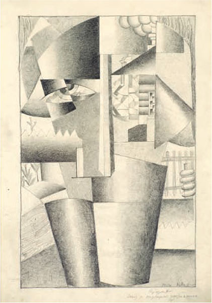
The show features a rare example of artistically perfect pencilled drawing, the “Portrait of a Builder” (1913) by Kazimir Malevich, which records the development of the picture’s idea between the “Portrait of Ivan Klyun (A Builder)” (1912) and the “Improved Portrait of a Builder” (1913, Russian Museum), a manifesto of Cubo-Futurism of sorts. All the experiments with form and space are “set forth” in this piece with the utmost confidence of an artist-cum-philosopher who created Suprematism.
Any medium or technique contains its own strong aesthetic potential. The choice of medium and technique is bound to influence the character of the drawing, the degree of its expressiveness, its weightiness; such choices largely determines the artist’s style. Both artists and viewers should always remember just such issues when contemplating the fine aesthetic interplay in the sublime and difficult craft of drawing.


© 2003-2024 THE TRETYAKOV GALLERY MAGAZINE
All rights reserved
The materials of this site can be used in other web-sites only if an active link www.tretyakovgallerymagazine.com is provided
E-mail: art4cb@gmail.com
The site was designed by Tatyana Uspenskaya

