


The exhibition “Mastery of the Pen”, featuring graphics from the holdings of the Tretyakov Gallery, is part of a show series focused on drawing techniques and media. The 300 pieces tracing the history of pen drawing in Russian art of the 18th-20th centuries include work by Karl Briullov, Alexander Ivanov, Fyodor Tolstoy, Ivan Shishkin, Isaac Levitan, Ilya Repin, Valentin Serov, Mikhail Vrubel, Konstantin Somov, Alexandre Benois, Wassily Kandinsky, Pavel Filonov, and many other famous artists.
One of the oldest drawing techniques, pen (quill) drawing has come a long way over the centuries. Depending on the age, pen drawings were marked by the austerity and serene harmony of Classicist contours, or by the emphatic sketchiness and cursoriness of a “croquis”, or by attempts to convey through hatching the shades of a tone, the play of light and dark. Depending on the artist’s individuality and the imperatives of the age, pen drawings were sometimes a peripheral, subordinate element, sometimes a piece of art in themselves.
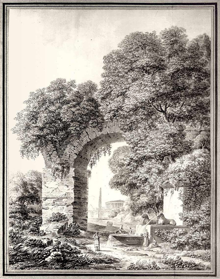
In Russia, pen and ink started to be used in the 18th century, and the nonRussian artists who came to Russia imbued with the mature tradition of Western European drawing, contributed much to the development of the craft. Works by the artist and theatrical designer Pietro Gonzaga, architects Giacomo Quarenghi, Charles Cameron, Jean-Frangois Thomas de Thomon, the small-size elegant pieces by Domenico (Dementy) Scotti and Gabriel-Frangois Doyen demonstrate the full variety of the creative capabilities of the pen. The Russian counterparts of those artists at the time were still in an apprenticeship stage, but their works, sometimes emphatically derivative — pictures of antique reliefs, copies of the old masters’ paintings and engravings — display the Russians’ aspiration to creatively interpret the original source. In the second half of the 18th century some Russian artists already displayed a confident command of pen and brush. Their works are marked by a sharp individuality of artistic techniques: the emphatic plastic expressiveness of the sculptor Mikhail Kozlovsky’s drawings, the tender harmony of Ivan Ivanov’s biblical compositions, the sophistication of Fyodor Matveev’s landscapes where sepia’s gossamer tone mingles with a fine pen-drawn lace, and the energetic, flamboyant drawing style of Stepan Galaktionov. The masterpieces of the graphics collection include the solemn “Landscape with Ruins” (1799) by Semion Shchedrin.
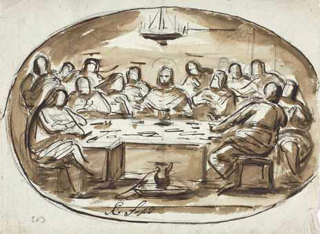
In the first half of the 19th century the craft of pen drawing was especially popular among the academic artists. Pen drawings were a requisite stage in the process of creation of mythological, biblical and historical compositions, as well as historical paintings and church murals. Classicist aesthetics, based on harmony and clearness of forms, was perfectly conveyed in the austere and neat lines of pen drawings. The St. Petersburg Academy of Fine Arts graduated a large group of prominent painters: Alexei Yegorov, Vasily Shebuev, Fyodor Brum, Orest Kiprensky, Karl Briullov, and Alexander Ivanov. The “Russian Raphael” was the nickname of Alexei Yegorov, an excellent graphic artist. An ink drawing “Mother of God Crowned by Angels” (early 1820s) stands out for its fine sense of line, faithfully captured rhythm, and musical plasticity of contours. The “croquis” “The Last Supper” (1820s) has a different expressive style: the colour combination produced by gallic ink and bluish paper, the vigor of the brush and pen strokes highlight the artist’s life force and imagination. Shebuev’s style, the complete opposite of Yegorov’s, is distinguished by steady, assured contour lines, neat silhouettes, and a preference for multi-figure compositions.
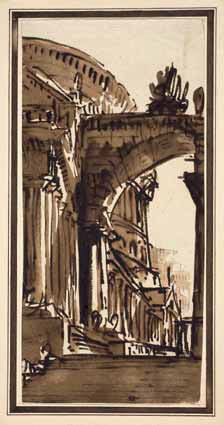
Yegorov and Shebuev were talented teachers who mentored many artists of the next generation. Fyodor Brunt, a prolific draftsman, was one of the most talented graphic artists, whose drawings and studies for the painting “Copper Serpent” (18271839) allow us to glimpse into the ways the artist worked on a big painting. Using a pencil drawing as the base, Bruni applied pen and ink to delineate the definitive “approved” elements of the composition, making them into finished pieces. Especially expressive are his small sketches and studies, where Bruni polished details, separate figures and fragments. The linear expressiveness of these pieces, the rapidity with which the pen literally races across the paper, leaving behind a nearly gossamer trace or bright splashes of hatchwork, demonstrate an uninhibited, emotional visual language.
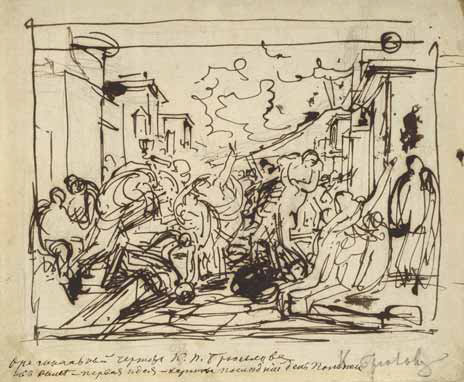
A unique command of all drawing media was a trademark of Karl Briullov; his pen pieces are distinguished by exceptional craftsmanship and truly Briullovian artistry. His small initial study for the painting “Last Day of Pompeii” (1828-1830), featuring curt, curly lines that seem to be racing along trying to catch up with the pace of thought, the birth of the idea, is a true masterpiece. The artist’s best works include an allegorical drawing “Knight’s Departure” (1836) featuring the shades of a tone and varied effects of hatches and blots.
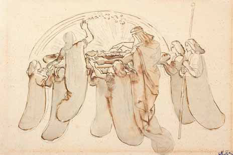
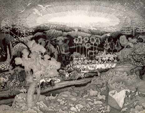
In the series of Alexander Ivanov’s small-size drawings themed on the Days of Creation the idea of the birth of the world is conveyed through metaphors using a variety of artistic techniques. The drawings depicting the birth of the universe are absolutely
free of any traditional academic dogma. Two biblical mainstays of the universe — light and dark — are represented, respectively, by the white surface of the paper sheet and the various gradations of the dark tone of ink and sepia. Every drawing is crisp, compositionally accomplished, and based on a combination of crisp pen-drawn images and astonishing light and dark effects. The sepia colour spots and ink blotches form a background against which the lines appear especially light and delicate, introducing individual emotional highlights in every scene.
The legacy of the landscapes of Maxim Vorobyev and his son Socrat Vorobyev includes a wide variety of pen drawings. The nature of a particular pen-drawn piece is defined by a motif noticed, a fleeting impression and mood. The drawings created by Maxim Vorobyev in Russia (views of Nikolskoye village, Moscow, and St. Petersburg) and during his travels in the Near East, the Greek Archipelago, Bulgaria, and Italy reveal an impeccable command of the pen technique as well as competence in toning the image with sepia and watercolour. Socrat Vorobyev, Maxim’s son and student, developed an entirely individual style. In a series of drawings depicting views of the city of Revel (now Tallinn) from 1838 the artist, skillfully varying the degree of force with which he plies the pen, conveys the volume and depth of the space and the rhythm of movements, plays up the contrasts between the light contours of historical buildings and the liveliness of lines, the fluidity of hatching in the images of trees.
Quite a contrast to the emotional drawings of Socrat Vorobyev, Fyodor Tolstoy’s works are imbued with calm and harmony. His illustrations to Ippolit Bogdanovich’s poem “Dushenka” (Darling, 1817—1833) are amazingly elegant in their purely linear expressiveness. The master artfully penned an exquisite lacework of lines on paper. The rhythm of the lines, their continuity, the lightness of the tracery, and the varied density of the pen strokes take on a nearly musical quality. In his treatment of an ancient Greek story the artist subtly conveyed his admiration for the classics. Tolstoy’s “Dushenka” remains in art history as a classical example of Russian book illustration.
The second half of the 19th century saw the rise of new types, genres and sorts of pen drawing and the development of an
individual, distinct style. This novel manner distinguishes the drawings of Nikolai Samokish, who for many years taught graphics and painting at an art school affiliated with the Artist Encouragement Society. Samokish published in 1894 a study guide “Pen Drawing”, frequently reprinted, where he summed up the main skills and techniques of pen art such as they were by the end of the century. At the time, paintings were central to visual arts; pen drawings were one of the tools for outlining and developing a future painting. The most noteworthy drafts and studies presented at the show include Vasily Perov’s pieces marked by a distinct graphic style. The artist used both pen and pencil in his drafts for the paintings, mingling the clear-cut pen-drawn contour lines with soft pencil-made toning. The techniques of toning and contour drawing blended, the graphic language achieved plastic expressiveness, creating painting effects (“ Woman-the- Holy-Fool Surrounded by Women Pilgrims” (1872), “Pleaders” (1879-1880), and “Dispute about Faith” (1880)). Perov would often first draft the general outlines of a composition with lively, confident strokes of the pen, neatly securing the edges of the objects, and then went on to round off the image with soft penciled toning (“Easter Eve” (1870-1873), “Predators from the Volga” (1878)). Perov’s other set of drawings includes improvised sketches marked by smooth fluid lines, such as “Ivan the Tsar’s Son Riding a Grey Wolf” (1879), “Spring the Beautiful” (1878) , “Women Walking to a Water Hole” (1879) , and “Woman Pilgrim in a Field” (1879).
In the second half of the 19th century the most important influence on the craft of pen drawing originated from its close ties with the publishing industry. Growing quickly, publishing in Russia at the time needed artists to illustrate magazines and numerous album-type publications. Most often the draftsmen opted for the medium of the pen because of its kinship with engraving. This encouraged development of certain drawing techniques which the connoisseur and researcher of Russian graphic art Alexei Sidorov called “noncontour drawing with open hatchwork”. A famous illustrator of historical books Vyacheslav Schwartz, who designed illustrations for the works of Alexander Pushkin, Mikhail Lermonov and Alexei Tolstoy, was a leading exponent of this trend in the use of hatching.
The mid-19th century witnessed a rise in the popularity of etching, which was taken up by Vyacheslav Schwartz and Viktor Vasnetsov as well as many other artists of the time. In 1871 in Russia Andrei Somov organized an Etchers’ Society, which had a large membership including, for example, Ivan Kramskoy, Ivan Shishkin, Fyodor Vasiliev, Konstantin Savitsky, Nikolai Ghe, Mikhail Klodt, and Alexei Bogolyubov. The technique of creating a design with a sharp needle scratching along a soft priming undoubtedly influenced the style of the pen drawing of many artists. Often the drawings looked almost like an etching. Shishkin’s etchings and pen drawings are so closely linked and so closely interact, sharing the same techniques, that the marriage of the two produced Shishkin’s signature hatching style distinguishing his graphic pieces, both the “hand-made” ones and the prints. In the age of the “Peredvizhniki” (Wanderers) exhibitions group, Shishkin was the top master of the craft of pen drawing.
Especially important for the development of this craft was the publication of a catalogue titled “25 Years of Russian Art. Illustrated Catalogue of the Art Department of the All-Russian Exhibition in Moscow in 1882”, which included “more than 250 photo lithographs, most of them reproduced by Messrs. Scamoni and Chesterman from the artists’ original drawings”. Innovative printing technologies allowed to make high-fidelity copies (replicas) of the graphic reproductions of the paintings created by the artists themselves specially for the occasion. The “Peredvizhniki” artists believed it was very important to make printed copies of their works so that as many people as possible could see them. The extraordinary popularity of the reproductions provoked interest in pen drawing among artists beyond the “Peredvizhniki” circle. Drawings made with pen and black ink on white paper, on the orders of publishers, heralded the black and white graphic pieces featured at the 1890s shows “Blanc et Noir” (“Black and White”), and in terms of style many of the drawings paved the way for 20th-century graphics. Thus, the exhibition features pen drawings made by Ilya Repin for magazines and books — in terms of their imagery, style and plastic ease these superb examples of unconstrained drawing are an artwork in their own right.
At the turn of the 20th century the graphic arts flourished. Sketch-making for future paintings and book illustrations, the traditional area of the use of pen drawing, was the main breeding ground for new approaches to the craft. Mikhail Vrubel’s illustrations represented a turning point where the 19th-century tradition of book illustration came to an end, giving way to different principles of interaction between the text and the image. The illustrations to Mikhail Lermontov’s’ poems were Vrubel’s public debut, which stunned the audiences with the novelty of their artistic language. The precious texture of Vrubel’s pieces — the fanciful tracery of the tiniest brushstrokes and dots and whimsical, “snaky” pen-drawn hatches - produces additional tonal gradations and, as Vrubel put it, “creates the atmosphere”. The artist aspired to image that which eluded portrayal — the poetic texture of Lermontov’s verse, the fragrance of his prose. The poet and the artist came into contact at the level of artistic techniques and the search for visual graphic analogues to their verbal inspiration.
The book artists became “freed” from the necessity to literally abide by the narrative, as is evidenced by the work of the “World of Art” and Symbolist painters. Book design, the “dressing up” of a book became for these artists an item on their agenda of the aesthetization of life and introduction of an element of art into it. Books were thought of as harmonious items mingling verbal and visual arts, a drawing and a text. The linear properties of drawing preserving the plane surface of a paper sheet, the decorative qualities of drawing, the combination of black and white, of silhouettes and hatching — these are the new principles, not even of book illustration, but of book design, conceived at the turn of the 19th century and fleshed out in the early 20th century with the advent of a whole new generation of artists who specialized mostly in graphics.
At that stage of its development the craft of pen drawing was in large measure influenced by the art magazines, whose design, in addition to illustrations, also included various elements of page design, such as vignettes, headpieces, and variations on the use of capital letters. The mouthpieces of different groups and associations, magazines such as “World of Art”, “Weigh-scales”, “The Golden Fleece”, and “Apollo” publicized their aesthetic agendas, their “philosophy of graphics”. The section of the show devoted to the magazine and book graphics traces the development of this art from the first pen drawings created by the art’s founders — the “World of Art” masters such as Alexandre Benois, Leon Bakst, Mikhail Dobuzhinsky, and Konstantin Somov — to the even more refined and decorative drawings of the “junior ‘World of Art’ artists” such as Sergei Chekhonin, Sergei Sudeikin, Konstantin Yuon, and the whimsical fantasies of the Symbolists such as Vasily Millioti and Nikolai Feofilaktov. And the show features a first-ever representative display of the bulk of the Scorpio publisher’s artwork archive, held at the Tretyakov Gallery.
Studies for paintings and monumental compositions, for murals in mansions and theatre sets continued to be a traditional area of ink drawing. Vrubel’s energetic pen-drawn study for the painting “Demon Prostrate” (1901) conveys the whole range of the tragic emotions of the finished piece and anticipates its plastic greatness. The small skimpy sketches made by Valentin Serov for Yevfimia Nosova’s house represent the artist’s “initial glimpses of the idea”, which were to be fleshed out later in large coal-on-cardboard pieces and coloured gouaches. In these drafts Serov polished the composition and general “concept of the painting” without dwelling on the figures. The quick light pen strokes turn these drafts into amazing “stills” filled with air and motion, which convey the effect to be felt in the future interior, the sense of the magnitude of the space. The inked “croquis” of Viktor Borisov-Musatov — the numerous studies for a mural design of Mme. Derozhinskaya’s house — help us trace the step-bystep materialization of the idea. “...My dreams are taking shape. Shall I find a place where they can be effected, where I can create a fresco the way I perceive it?” wrote the artist2. The murals either were not accomplished or were later destroyed, but thanks to the sketches they are now a piece of art history.
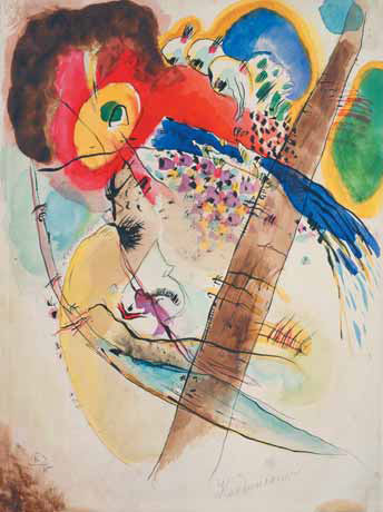
The early 20th century was an age of ostentatious individualism, and the art experimentation of the 1910s influenced pen drawing as well, with every artist testing the new waters in his own distinctive way. Quite naturally, the avant-garde artists, with their penchant for abstract forms, were keen to explore the natural properties of the pen and its varieties — the stick, or the shank of the brush. They were interested in pure — abstract — expressiveness of line, and its interaction with colour spots. They often drew on the “lubok”, traditional folk and primitive art (both European and Oriental), where the properties of form are naively exposed. So, the marriage between an interest in popular prints (Wassily Kandinsky’s interest in German glass paintings, and Georgy Yakulov’s interest in Japanese prints) and the authorial theories of light and colour produced such works, presented at the show, as Kandinsky’s glass pieces (“Lady in a Golden Dress”, 1917; “Ship” c. 1918; “Amazon”, 1917; “Ladies in Crinolines”, c.1918) and Yakulov’s compositions “Race” (1905) and “Cafe Chantant” (1906) — remarkably beautiful and engrossing dialogues, on equal terms, between line and colour. To an even greater degree these “dialogues” were pictured in Kandinsky’s non-figurative works. The graphic and colourful painterly elements in his work continuously interact, and this interaction is pivotal for the overall composition.
For Pavel Filonov, with his predilection for an analytical approach and eagerness to “expose the atomistic structure of objects”, pen drawing became an ideal form of expression. His hatched dots, hatched scratches seem to reveal the inner nature of an object or occurrence, the movement of “the juice of life”. In Filonov’s hand the pen became a surgeon’s lancet that penetrates the outer cover of things. “The eye of the investigator, inventor — the master of analytical art — aspires to an all-round vision.: he watches with his analysis and brain, and he can see where any other artist’s eye fails to,” he wrote3.
The artist Natalia Goncharova made pen drawings occasionally, and the pieces differ depending on the goals pursued. The famous composition “Electric Chandelier” (1912), based on the contrasts between black lines of different thickness and the fair surface of the sheet, is often thought of as a manifesto of Rayonism. In the 1920s-1930s, when she developed a passion for Chinese and Japanese art, Goncharova discovered for herself other possibilities of this technique. Expressiveness of lines gave way to a softness of tonal gradations and effusive blots in combination with a fine pen-drawn “framework” of lines.
Mikhail Larionov made gouache drawings only occasionally, and when he did, he used, instead of a pen, a little stick, which delivered more fluent contour lines. The use of this implement delivered an especially impressive result in Larionov’s illustrations for Alexander Blok’s poem “The Twelve” (1920). Sometimes it appears that the drawing medium itself led the artist to opt for a certain manner of drawing. When Larionov bought, from an antique dealer on the banks of the Seine, an old piece of paper and a bottle of walnut ink, the traditional implements of the 18th century, he felt as if he lived at the same time with the famous draftsmen of the past. Such is his “Old-style Portrait of a Man” (1920s-1930s), fashioned in the manner of the old masters. Not accidentally, this item is the last in the array of the exhibits at the show, spawning a thread — “a fine pen-drawn thread” — that reaches back to the show’s starting point, to the brilliant works of the European masters who gave birth to the culture of pen drawing in Russia.
The author used material from Anna Antonova’s and Lidia Torstensen’s publications.

© 2003-2024 THE TRETYAKOV GALLERY MAGAZINE
All rights reserved
The materials of this site can be used in other web-sites only if an active link www.tretyakovgallerymagazine.com is provided
E-mail: art4cb@gmail.com
The site was designed by Tatyana Uspenskaya

